Showing posts with label Wilmavoermans. Show all posts

Sunday, August 14, 2016

Seaside Cottage and Tranquility inspiration layouts by Wilma


Two for the boys.

Our August challenge is a nice one.


And a easy one.
Just use one of three collection.
Seaside Cottage, tranquility or Attic Charm.
My plan was to add three layouts , one for each of these colections.
But because beautiful Switzerland is overcrowded with tourist this saison....
I just coudnt get time enough to do anything creative.
So there was no time for the Attic Charm inspiration layout.
But when you look at the blog, 
there has been lots of inspiration already with the Attic Charm collection


For my first layout I used the beautiful Seaside Cottage collection.
Perfect papers to scrap your beach pictures.
For a beachy and masculine feeling I used textured modeling paste,
 in my background and on my chipboard.

First I colored the title with distress ink.
Than I added the texture paste with a pallette knife.

The seaside Flourish chipboard piece was first stippled with the paste.
Than I added different colors of embossing powder in the still wet paste.
I heated up just a few parts of the powder.
After it dryed here and there a little raw paste to give that beach feeling.


*******

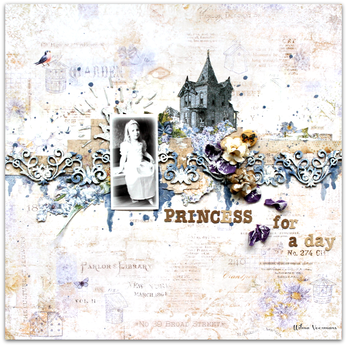
My second layout has more of a tender feeling.
I wanted a soft natural look.
In the background stamping with a blue color ink that matched perfect with the blue from the paper.
Softened up with white ink.


I love the Wild Field chipboard and I think it matched perfect with the stamped background.
I left it natural and just brushed on a little white ink to set some highlights.
The chipboard is totally flat on the paper, but because of the highlights it becomes depth.
The roses were left in their natural color, just got some white ink here and there.
To keep the page in that soft natural color I left the title just plain .


I hope you will find time to play along with our challenge, there are two more weeks left to join in.


Thank you for visiting the blog.
I hope you liked my post.
x Wilma x


Thursday, July 21, 2016

Seaside Cottage and Tranquility collections with video by Wilma Voermans

So happy to show you two layouts with the new Seaside Cottage collection.
It was a last minute, since I just got my papers in, but I managed .
Scrapbooking is a great hobby to  relax after busy days at work :) 

My first choice of the collection is this SUPER background paper.
It is the B-side from the Mermaid paper.
The Seaside collection has a lot of great background papers for more masculine pages.
And the boys have to be scrapped too .

I am not sure or I  did it ever before, 
but I found out that alcohol ink is perfect for coloring chipboard.
It dryes quick, covers in one time and gives a beautiful mat finish.
Besides that it soakes into the chipboard ,  so the sides are colored too.


In the background I used Gold embossing powder and two  colors alcohol ink.
If I may say so myself...LOVE IT 
Chipboard that I used:
Celebration heart
XOXO set
Ornate frame
Number Grid small
*******

The second layout I made is also from the Seaside Cottage collection.
Its called Gala.
And yes, also the B-side..
I just love that paper with the Italian map image and the beautiful old color rosa.
The ornate frame was first embossed with oatmeal.
After that I brushed it with distress ink which was the right color for me.
I gave it a quick spray with a sealer to make the ink stay.
In the background I used Ginger embossingpowder
*******


My last layout is made on a pattern paper from the Tranquility collection.
I can explain what I did, but it is much easyer to watch the video I made .
A start to finish process video.
I hope you find the time to watch it here:


A few closeups:

Chipboard used:
Blooming foliage
Circle panel
Flowers all Blue Fern Studios..

Thank you so much for visiting the blog!
x Wilma x


Monday, March 14, 2016

3x Layout inspiration by Wilma

When I got the Courtship lane collection I saw so many possibilities.
It is just hard to decide which paper to use first ;) 
My first layout is made after the March sketch.
The picture is not the best quality... but I love it so much.
She was walking and acting like a princess that day, but also princesses get tired and soar feet.


The sketch:

For my background I used the beautiful Royal street paper.
And I fussy cut a  few parts out of the West Plaza paper.


The beautiful chipboard  Symphony  was first gessod, than sprayed with colormist in the wet gesso.
Than I took a white piece of cardstock and depped it here and there.
The white shows through and you are left with a great background for a card and colored chipboard..

A few Blue fern flowers and finishing touches ....

*******


This next  layout was super fun to do.
Playing with color just makes me happy.


My background is made with ecoline watercolor and some Blue Fern Studios embossing powders.
The stamp I used in the background  comes from the Texture1 set .

I cut up the Mod Square panel, and embossed it not to neat with pearl embossing powder.

*******

The last layout for today is also made with the Courtship lane collection :


The chipboard flowerframe and the titel  are colored with Gansai Tambi watercolor.


Thanks for visiting the blog, I hope you liked my post.
x Wilma x


Sunday, December 27, 2015

Snowy feelings....from Switzerland.


I hope you had beautiful Christmas days .
In Switzerland there was no snow , it was warm and the tourists are dissapointed.
Since I wanted to make a snowfeeling layout I took  pictures from last year.


For my background I used a paper from the vintage Christmas collection.
I added clear gesso on both sides to make the paper sturdy .
It also helps to have a flat page.
On another (same) paper I doodled circles.
Than I punched some flowers out of it.
I took a a normal flowerpunch, and glue them in a pattern using both sides .
Behind my picture a paper with Swiss images I found at the tourist info .
The negative leftover pieces from the punching are tucked in between the layers.

Over the whole page I glued silverfolien , just little pieces here and there.
The chipboard is the charming snow medley piece.
I cut it in 4! pieces and used them all over the page.
All I did was painting 2 layers with my wink of stella pen.
The chipboard gets just a little darker with a beautiful soft shimmer.
The titel was also done like this, but just one layer with the glitterpen.
I rubbed some gesso over it to give that snowy feeling.

Thanks for visiting the blog
x Wilma x


Thursday, December 17, 2015

Vintage Christmas Collection - winter feeling

Hi, so nice you found the time to visit the blog in the busy Christmas weeks.
Not everybody on this world celebrates Christmas .
Today I want to show you that the beautiful Vintage Christmas collection can also be used on other themed layouts . 
The first one is a mixed media page on my favorite paper from the collection.
                               The background is gessod and for the color I used alcohol inks.
               The title piece xoxo was painted white and I added some fairydust when it was still wet.
                       It gives a beautiful glitsery shine, which is hard to see in the picture.


I cut a Brick Ring in two and colored it with two colors ink.
The background stamps come from my favorit stamps out of the collection 
 textures


*******


My next layout is made after the beautiful sketch for this month challenge.


For me,  this picture shows the line between fall and winter.
I wanted to mirror the picture in my background.
There is a lot of stamping going on .
The chipboard grid piece was perfect to tuck under my photo cluster.
It holds the natural feeling I like .
The titel piece is embossed in dark brown.

*******
Thanks for visiting the blog and Merry Christmas to all of you.

x Wilma x


Monday, November 16, 2015

Goodbye fall, welcome winter !


It becomes serious now, winter is coming up .
Well, in Switzerland it does...
A lot of snow coming this way.
With this in mind I remembered this lovely picture I wanted to scrap for some time.
The Vintage Winter collection can be used for non related Christmas themes, 
 as you see on my winter scene layout.

My idea was to keep the page simple in the colors of the picture.
I added gesso and misted the page over the wet gesso.
Stenciled snowflakes here and there .


The Berry Stems did get two coats of gesso, just dabbed on.


For the beautiful snowflake dangle I first gesso the chipboard .
In the wet gesso I sprengled some good old fairydust .
I did the same on the bird.


The title stamp FRAGILE comes from Blue fern too.
It is on of the stamps from the Postal textured stamp set


Thanks for visiting the blog
x Wilma x


Wednesday, October 14, 2015

Two more layouts by Wilma with the beautiful Autumn Anthology collection .

                            For my first layout we have to go back in time ........ 40 years !
                             I used the original picture of young me, I become vintage :)
                     The background paper is one of the Autumn Anthology collection, Gazebo
                           To create more interest I use the circuitry chipboard as my mask.
                                   I had to spray it anyway with gesso for another layout.
                  So now I had a white chipboard piece and textured background at the same time.


                                           Behind the picture I used the Wild Flourish frame .
                                               And one bird from the Little Birds set.
              All I did was adding some thin gelmedium to keep the original natural chipboard color.


I cut a few paper flowers from another paper out of the collection.
Glued it behind my flower.
********


My next layout , also made with the Autumn Anthology collection.
The picture is about 25 years old, bad quality .
But thats what we had than....and we should just use them on our layouts.

For the background paper I used the Parfumerie paper.
I toned down with gesso, leaving out some of the beautiful background pattern.
I pushed  a embossingfolder in the wet gesso to get the checkered texture.
Than I colored the background with 3 of the new mists:


The chipboard ( checker bits ) was inked up with a chipboard kind of color .
Than I embossed here and there with one of the new embossingpowders : petal
To tone down,  again some mixed media ink.


New are the glitters and embossingpowders at Blue fern Studios.
Just when I was finishing this layout my package arrived !
So I added some on my flower.
A little glitter never hurts :)
I used the Pyrite , a beautiful goldtone.


Thank you for visiting the Blue Fern Studios blog.
Have a great week
x Wilma x